Why Your Outfit Looks Completely Different at the Venue
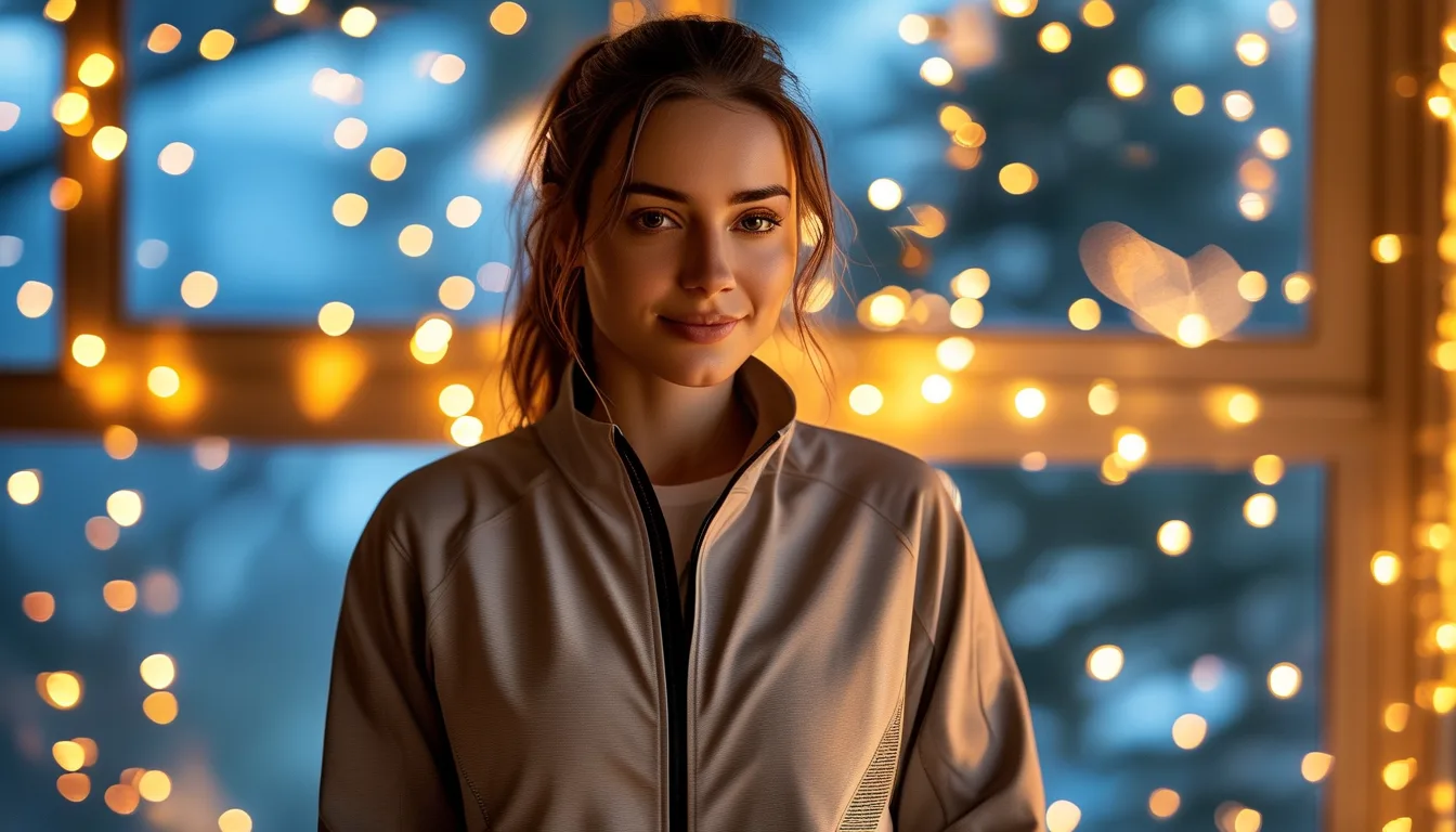
Quick Answer: Outfits look different at venues because light sources vary enormously in colour temperature and in which wavelengths they actually contain. Warm, low-quality restaurant lighting can drain blues and greens and turn cool-toned fabrics grey, while daylight-balanced LEDs flatten warm tones. Check any event outfit under the type of light you will be in, and favour fabrics with texture over flat colour, because texture reads consistently under any light while colour does not.
You tried it on three times at home. It was perfect.
You walk into the venue, catch yourself in a mirror by the bar, and it looks like a completely different garment.
Nothing changed except the photons hitting it, and that turns out to be plenty.
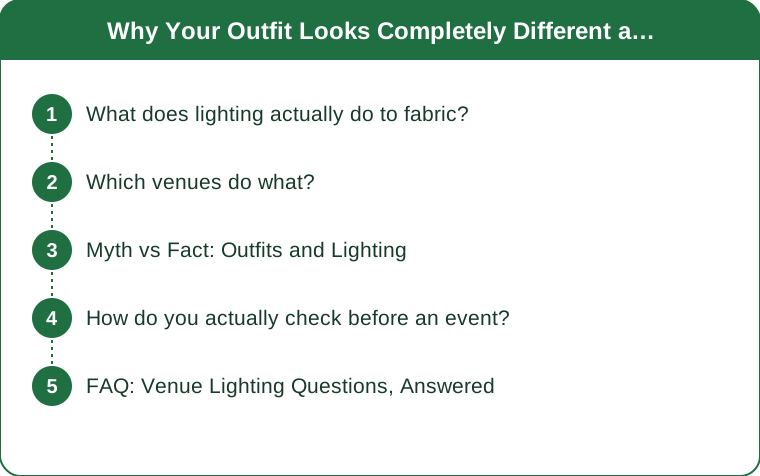
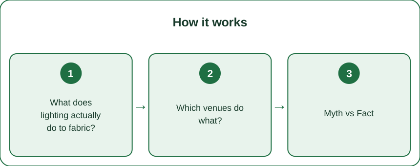
What does lighting actually do to fabric?
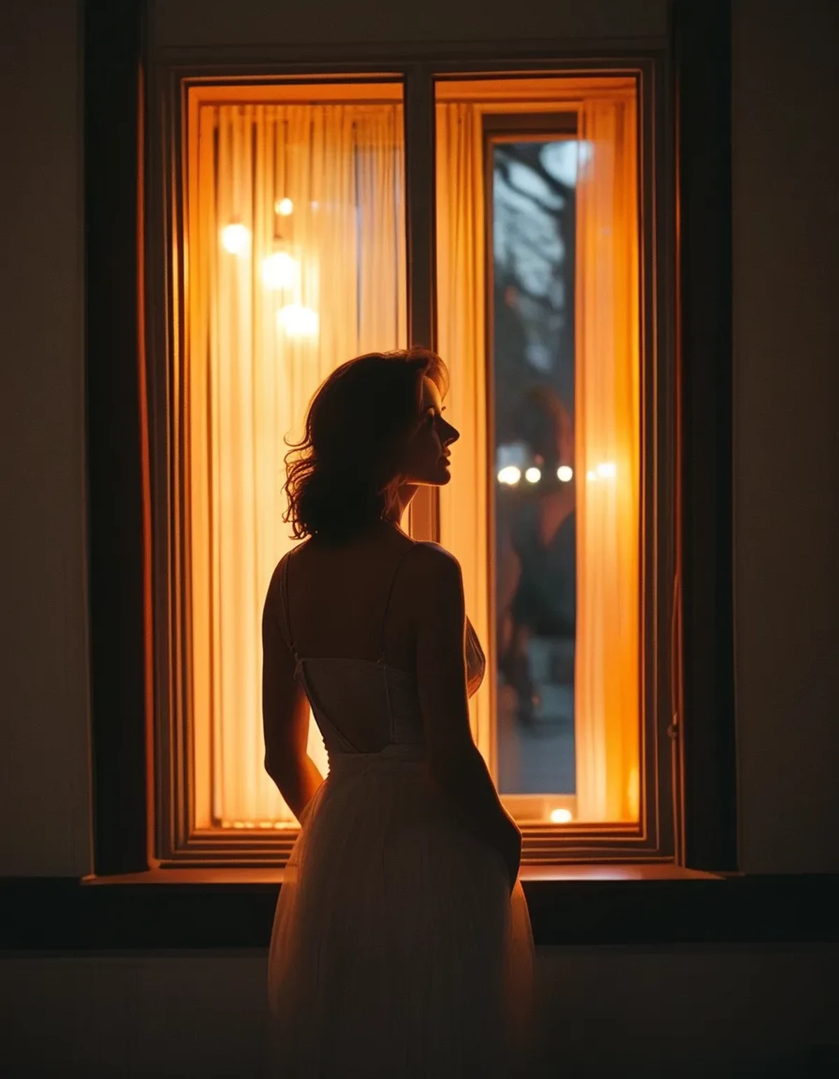
It determines which colours can be reflected at all — you cannot see a wavelength that is not present in the light.
Colour temperature shifts the whole picture. Warm restaurant lighting typically sits around 2700K, daylight around 5500 to 6500K. Under warm light, everything is shifted toward yellow and red. Cool-toned garments — icy blues, cool greys, blue-based reds — lose vibrancy and can read as dull or muddy. Warm tones amplify.
Colour rendering matters as much as temperature. Cheap LED and older fluorescent lighting produces an uneven spectrum with gaps, so certain colours simply have nothing to reflect. This is why some garments look strangely flat under specific lights in a way that no white balance adjustment fixes — the wavelengths are genuinely absent.
Direction changes texture. Overhead lighting, common in restaurants and event spaces, creates strong downward shadows that flatten the front of a garment and emphasise anything horizontal. Side and diffuse light reveals texture and drape. A pleated or textured piece that looks rich in your window-lit bedroom can look flat under downlights.
Fabric finish reacts differently to each. Satin and anything with sheen throws directional highlights that can look elegant under soft light and harsh under a spotlight. Matte fabrics look consistent under everything but can read as flat in dim rooms.
Black is the most variable of all. Different black garments contain different undertones — some warm-brown, some blue-black — and mixing two blacks that looked identical at home can look obviously mismatched under warm venue light.
Which venues do what?
Predicting the lighting is a large part of getting this right.
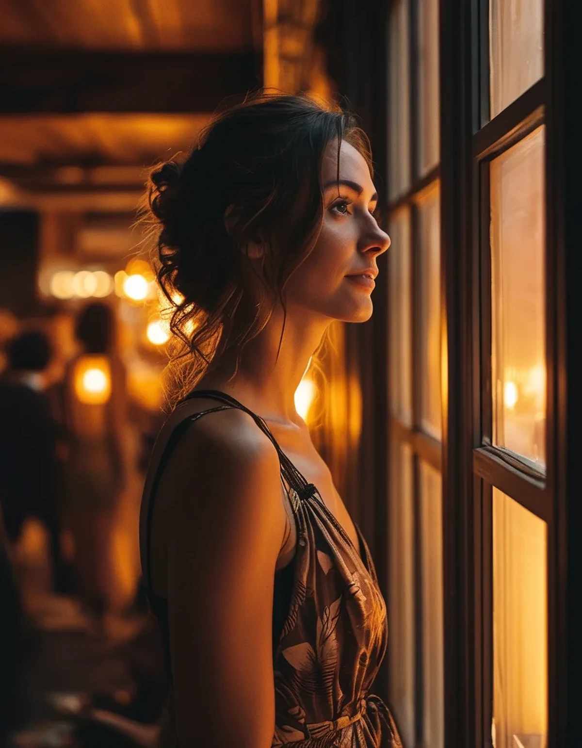
Restaurants and bars: warm and dim. Expect 2700K or lower, often with candles. Cool tones flatten, jewel tones deepen and look excellent, black reads well, pale pastels can look washed out or slightly yellow. Metallics come alive in low warm light.
Hotel ballrooms and event spaces: mixed and unpredictable. Often a combination of warm ambient and cooler task lighting, sometimes coloured uplighting that can do genuinely unexpected things to a garment. Colours near the uplighting hue will saturate strangely.
Offices and daytime venues: cool and bright. Overhead lighting closer to daylight, which is the most honest but also the least flattering. Warm-toned fabrics stay true, cool tones look crisp, and every texture and crease is visible.
Outdoor evening events: rapidly changing. Golden hour, then blue hour, then whatever artificial light exists. An outfit chosen for photos at 6pm can look completely different at 8pm, and this catches out people planning around a specific photo moment.
Anywhere with photography: flash overrides everything. A camera flash is close to daylight-balanced and much brighter than the ambient light, so photos will show colours the room did not. This is the single most common reason an outfit looks great all evening and disappointing in every photo.
Myth vs Fact: Outfits and Lighting
Myth: If it looks good in daylight, it looks good everywhere. Fact: Daylight is the most complete spectrum, so it is the most honest test — but a garment that depends on subtle cool undertones can lose exactly those under warm venue light. Honest is not the same as predictive.
Myth: Black is always safe. Fact: Black is safe in shape and reliably slimming, but blacks differ in undertone, and two pieces that match at home can visibly clash under warm light. Check any two-black combination under a warm lamp before committing.
Myth: Sequins and metallics are the risky choice. Fact: In dim, warm venues they are often the most reliable, because they reflect whatever light exists rather than depending on their own colour. It is flat pastels and cool-toned solids that struggle most.
Myth: A phone photo tells you how it will look. Fact: Phone cameras aggressively auto white-balance, which corrects exactly the shift you are trying to evaluate. Look with your eyes, and if you must photograph, lock the white balance.
Myth: The changing room mirror is the problem. Fact: Changing room lighting is usually chosen to flatter, but the real issue is that it is one specific light. Any single light source, flattering or not, tells you about that light only.
How do you actually check before an event?
Five minutes of testing removes almost all of the risk.
Check under a warm lamp and near a window. Two light sources, thirty seconds each. If the outfit holds up under both, it will hold up almost anywhere. If it only works under one, you have learned something important before it mattered.
Check it standing up, from a distance, not up close. Venue viewing distance is several feet, not the eighteen inches of a bathroom mirror. Colours blend and texture reads differently at distance.
Photograph it with flash. This simulates what every photo from the event will look like, and it is the single most useful test if photos matter to you.
Favour texture over flat colour when the lighting is unknown. Weave, pleating, ribbing, sheen and drape all read consistently regardless of colour temperature. A textured neutral outperforms a flat statement colour in an unpredictable venue almost every time.
Match your accessories in the same light you tested the outfit in. Metals shift noticeably — gold intensifies under warm light, silver can look grey and dull. If you are wearing both, check them together under warm light specifically.
Consider the transition, because this is the season for it. Early autumn events increasingly start outside in daylight and end inside under warm artificial light, sometimes with a temperature swing of ten degrees between them. An outfit chosen for one half of that evening will be doing something else by the second half — check it under both, and plan the layer accordingly.
When genuinely unsure, choose depth over brightness. Deep jewel tones, rich neutrals and anything with sheen survive warm dim lighting better than anything pale and flat.
FAQ: Venue Lighting Questions, Answered
Why do I look washed out in event photos?
Usually flash, which is much cooler and brighter than the room. Pale, cool-toned fabrics near the face amplify it. A warmer tone or a textured fabric near the face helps considerably.
Which colours are safest in dim restaurants?
Jewel tones, deep neutrals, black and anything with a sheen. They rely on depth and reflectivity rather than on wavelengths the lighting may not contain.
Do metallics really work better in low light?
Yes — they reflect available light rather than depending on their own colour, which is exactly what you want when the light is dim and warm.
How do I match two black pieces reliably?
Hold them together under warm incandescent or candle light, which exaggerates undertone differences more than daylight does. If they match there, they match everywhere.
Should I bring a mirror check at the venue?
A quick look in the venue lighting when you arrive is genuinely useful — not to change anything, but so nothing surprises you later in a photo.
Does this apply to makeup too?
Strongly. Makeup applied in cool bathroom lighting frequently reads much heavier under warm venue light. Applying near a window and checking under a warm lamp solves most of it.
TL;DR:
- Lighting determines which colours can be reflected at all — warm venue light drains cool tones.
- Restaurants run warm and dim; jewel tones, deep neutrals and metallics hold up best there.
- Flash overrides ambient light, which is why photos look different from the evening you remember.
- Test under a warm lamp and near a window, standing, from a distance.
- Texture reads consistently under any light. Flat colour does not. When unsure, choose texture.
Check two light sources for five minutes and you will never be surprised by a venue mirror again.
Keep Reading
This article is for general informational and styling purposes only. Fit, sizing, and product availability may vary.